Search This Blog

Sunday, 12 December 2010

Brick (Johnson, 2005, USA) Analysis


Film Title:
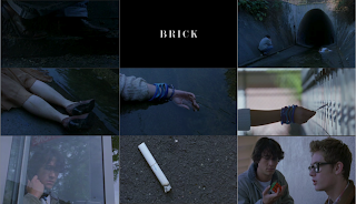
The title of the film is portrayed in a very simple, easy to read fashion, but, this turns out to be extremely effective and meaningful. The sheer simplicity means that nothing is revealed tot he audience leaving them with the fear of the unknown. And, it is meaningful as just before the title comes up we see the hand/arm of a dead body suggesting that the title and that dead bosy are linked, creating questions to what is the meaning of the title and the connection the corpse and the title share. The white writing against a black backdrop, spaced apart gives a very chillinh portrayal as white against black isnt seen as a positive tone, but a negative tone, making the audience feel on edge and unsettled.

Setting/Location:
The setting is revealed as a location near a high school, but the first setting we see by a sewer is portayed as dark, dingy and depressing, which in this shot clashes against everything around it as the sun is shining, its broad daylight and seems like an urban environment. This confuses the audience because it makes them think how can a murder take place in a highly populated area without being noticed by anyone but this one person. The dark shadows present a cold feeling and as a result the audience feel a state of shock.

Costumes/Props:
All the people you see are wearing modern clothes but I think that the things that are more important are small unoticable things like accessories because they could be the key to indetifying who is who throughout the film. Also, there was a piece of paper providing the character with a location that he assumed was a meeting point, this prop is vital to linking the boy into the next setting and gives subtle clues as to whats going to happen next, yet, at the same time it makes the audience think deeply about what could happen as they have been kept in the dark so far. Also, the dead body has vibrant clothes on showing that the dead body of the woman was young and vibrant which is ironic because shes now dead in a dingy sewer.

Editing/Camera Work:
An effective shot used is when the boy is at the phone booth talking on the phone when suddenly he begins to looks around, this is achieved by a handheld camera movement in order for it to see natural and to suggest to the audience that he doesnt want to be there. Also at the beginning we see a close up of shoes which fill the whole frame limiting what the audience can see, instantly making them want to see more, drawing them in and making them inquisiive to find out who that person is and why they are there. Another effective shot is the close up of the dead womans leg which seems to be muddy or dirty, which makes the audience ask why, as she isnt dressed for those kind of activities (she is dressed formally), suggesting she expect to end up the way she did or doing what she did to end up dead. This makes the audience even more suspicious as to whats going on and this sense of suspicion is increased by them not being able to see what the dead womans face looks like keeping her mysterious. We then see a extreme close up of a cigarette that was dropped by another un seen character, with the boy infront of it we see an arrow pointing to the boy, suggesting that there is a link between the cigarette and boy giving the audience a clue in to whats going to happen next but not revealing anything else, building the suspense and tension.

How The Opening Sequence Sets Up The Story:
The opening sequence sets up the story by providing the audience with very subtle clues about whats going to happen but not revealing any solid evidence that leads straight to the answers the audience are looking for making them want to watch more, keeping them on edge and engrossed in the film. It also sets up the story to be very calculated because all the clues that have been given so far have been physcological meaning that mental games are being played rather than just brutal attacks as were used to seeing.

Genre:
The genre is thriller and the opening sequence suggests this by keeping the audience in the dark, tense music, mysterious characters and a murder or death, all this keeps the audience constantly thinking and complys with the stereotypical conventions of a thriller, therefor making it a successful film.

What Does A Title Sequence Look Like? (Se7en)

The title sequence gives an insight into who is starring, the producers, directors and clues as to how the film will be set out. The title sequence also captures the viewers attention telling them subtly what to expect in the forthcoming film.

Wallander (Firewall, MacCormick, 2008, UK) Analysis


Film Title:
This program was slightly different to films as it was a series program, as a result we saw the opening sequence before the title. But, when the title appeared it was still effective as it conveyed two very striking and symbolic colours being; yellow and black. Both of these colours are used when warning and danger signs are needed, this could symbolise that the program is dangerous or that something dangerous is going happen, drawing the audience in as they a inquisitive to find out what. Just before the title comes up you see a blade falling, as the title appears you also see a black object falling which would seem to be shaped as a knife similar to the one falling previously suggesting a link and that the knife is part of the danger, and, that it is also a key part of the program.

Setting/Location:
The opening sequence is set in a countryside with lots of grass and country roads, suggesting a remote area far from city life. This remote area creates fear and isolation for the audience as it seems like a place where anything can happen and nothing would be able to it from happening. Also, the setting is revealed as an extreme long shot meaning that the audience can just about about see the objects in the frame being, a white car and two people walking, this creates curiosity as the audience will ask why is the car stopped in the middle of nowhere? and why are those two people walking away? The setting is also revealed as gloomy and dark setting the tone for the opening sequence of negativity, making the audience on edge as they know whats going to happen next isnt going to be positive. On the other hand, the setting isn't very revealing as it doesnt show anything but trees and greenery, keeping the mystery about the area.

Costumes/Props:
The first thing you realise about what the characters are wearing is that they both seem to be wearing quite modern clothes as if they were from the city which goes against the stereotype of what people from the country would wear siggesting that they arent from around where they are. Thismake the audience uneasy about the two characters as they look out of place, placing suspicion on both of the characters. Also, one character who seems to be the older out of the two has black hair with pink streaks, a leather jacket on and black nails, these are all the stylings of a goth or what would seem to the audience as a rebellious teenager, providing the viewers with some idea of how they would expect her to act. The two characters have blood on their hands and faces linking to the car (taxi) where we see a man unconscious. This makes the audience ask whether the girls did it and if so why. At this stage you can see the two back doors of the taxi open meaning that the car wasnt stopped before the incident happend to the man, this suggests that the attack happend during transit meaning that the attack was planned. This makes the audience scared as they now realise that there's more to these two girls than meets the eye.

Editing/Camera Work:
The shots used are effective in setting the tone of the opening sequence as the first shot used; an establishing shot of the sea, looks gloomy with grey skies with the sea looking dull creating a dark and negative tone, making the audience feel depressed and unaware of what shocking thing they're going to see next. There is then a close up of the windscreen where you can see blood splattered on it, this focuses on the extremity of what has happened and makes the audience think that these two young girls can be responsible for such a brutal attack. Also, there is a close up of the man slumped on the steering wheel with the two girls blurred in the distance, this creates a subtle hint that the two girls are the people who have done this as the three characters are placed in the same shot linking them all together. Another shot that is effective is a extreme level close up of the meter suggesting to the audience that the man was taking them to a destination, telling the audience that the two girls havent met this man before and that he was innocent. As a result it makes the audience angry because there seems to be no logical reason for the attack on the man, and therefor the audience dont trust the two young girls. When the two girls are walking there is an extreme close up of them, the girl with the leather jacket has more blood on her face than the other and seems to have a facial expression of an adrenaline rush as if she enjoyed what just took place. Also in this same shot the other girl is slightly out of focus than the one with the leather jacket suggesting that she is more important than the other girl, and, that she is the leader of the two.

How The Opening Sequence Sets Up The Story:
The opening sequence sets up the story as it forces the audience to ask lots of questions making them want to know whats going to happen next. It does this by keeping the viewers with little information making htem feel unsettled and uneased because they dont know whats going to happen, they dont know due to the fact that the two girls have already combated stereotypes of teenagers being able to brutally attack a man, keeping the viewers on ege building suspense and tension.

Genre:
It is a thriller as it follows all the basic conventions including, tense music, mysterious characters, unknown settings and violence.

Double Indemnity (Wilder, 1944, USA) Analysis


Film Title:
The film title is very effective int he way its presented as it grabs the audiences attention and creates immediate curiosity. It grabs the audiences attention by filling the whole frame, being in capital white letters, and having a bold font. It also creates curiosity due to the fact that at the same time the film title appears on screen you can see a silhouetted man walking on cruches in the background. This makes the audience ask questions about this mysterious person; how did they get that way? Where are they going? And, who is that person? This combination forces the audience to want to see more in order for their questions to be answered and as a result is an effective way of drawing in viewers.

Setting/Location:
The opening sequence is located in Los Angeles, a big American at that time, suggesting to the audience that if the characters are from this area they may be wealthy and of a higher class, this places stereotypes on characters before we are introduce allowing the audience to imagine what the characters should be like and how they expect them to behave. It is set in an office building where you find out that the man is going to an insurance office. This creates a subtle clue to the audience as to whats going to happen as it links the title of the film with insurance, telling the audience that this man will be a main character. But, the man arrives at the office at an unusual time, being night when work is finished, making the audience suspicious as to why he's back at work passed working hours. This allows the viewers to ask more questions about this man as to why he's there at that time and what he's going to do there.

Costumes/Props:
The first prop that would catch the viewers eye is the car driving very eratically and fast, this unsettles the audience as it creates a state of panic and further curiosity; at this stage the audience would be asking, who's driving? Why are they driving like this? Where are they going? All these questions keeps the audience inquisitive and wanting to find out more, therefor focing them to watch on. It also makes the audience think if it links with silhoutted, injured character, which could possibly be the explanaition for the eratic driving, becuase the driver is injured. We then go on to see the same car drive passed a stop sign/red light suggesting urgency creating confusion between the viewers because it makes them think whether the driver is injured or in a hurry, making the audience also feel isolated as they are being left in the dark as to whats going on. The character that was driving the car is seen to be wearing a trench coat and a top hat similar to the clothes of the silhouetted man on cruches, suggesting that they are the same man giving the audience a clue in to the importance of this man.

Editing/Camera Work:
There first effective shot that you see is the opening establishing shot of a main road with a sign post saying 'Los Angeles Railway Corp' this immediately set the scene and tells the audience that the opening sequence is based in a big city of America, showing tall buildings. Also, in this shot you can see lights along both sides of the road telling the audience that it's night time and it explains why the roads seem deserted. Another shot that is effective is when the man first enters the insurance office; this is a long shot showing dozens of office desks with cleaners emptying bins. This emphasises to the audience that work is most definately over as no other collegues are present, making them ask why he's there again. Also, there is a level mid shot of the man and another old man in the lift, this level shot reveals the mans height and stature, as he is clearly taller than the old man. This makes him seem menacing and as a result at this stage the audience feel uncertainty as to whether they can trust this character yet. Finally, the last effective shot you see is a high angle mid shot of the man sitting down with what seems to be a gun shot womb, he then lights a cigarette suggesting stress and axiety. The high angle mid shot makes the character looks small and defenseless, enabling the audience to ask whether this is the man on his last legs before something happens, as a result it draws the audience in and makes them want to see the outcome.

How The Opening Sequence Sets Up The Story:
The opening sequence sets up the story because we already have and injured man, mysterious behaviour, a murder and a confession. These are all things that would usually happen throughout a film but in this one it has happended in the first 10 minutes, this puts the audience on edge and interested as they have seen so many different scenarios already. This makes the audience inclined to watch on as they want to find out who was murdered and why the man confessed.

Genre:
You can tell that the film is thriller because the opening sequence supplies the viewers with all stereotypical conventions of a thriller including, tense soundtracks, mystery, isolation and murder, all these convention combine to make a very effective and good film which succeeds at drawing in the audience and making them feel unsettled.

Friday, 10 December 2010

Brief

To create the titles and opening sequence to a thriller movie, lasting no longer than two minutes.

Thursday, 9 December 2010

Kiss Me Deadly (Aldrich, 1955, USA) Analysis


Film Title:
The film title is immediately unusual as it comes up the screen instead of down which goes against the stereotype that the titles go up at the end of the film. This could have a hidden meaning in the end is only the beginning, self consciously making the audience think what is going to happen. While this is happening the order or words is in reverse meaning they have to be read backwards creating confusion, making the audience on edge as things havent started as they should do. This reverse order also reveals the title to, on first sight, to be read as "deadly, kiss me," suggesting that there is going to be subtle twists and turns in the film and it also tells the audience to expect the unexpected.


Setting/Location:
It is set at night, on a dark, isolated road in the desert. Being set at night instantly creates connatations to negativity and fear as night means dark and dark means the unknown. This sense of fear is then reinforced by the road being isolated meaning it was in the middle of nowhere with no civilisation in sight, this makes the audience think that if anything was to happen here no one would know and nothing could be done making them on edge and creating tension. Also, the fact desert is surrounding the road makes the audience understand that this is very much the wild and any mysterious creature or being could be lurking around building up the fear for the audience.


Costumes/Props:
The woman is wearing a long brown trench coat with no shoes and what would look to be no clothes on underneath, this creates curiosity in the audience as they arent sure why shes in this state. But, from the style of the womans hair you can tell that this films is from the past as it is a vintage style. This is then backed up by the man having on clothes from an older era and driving a classic car from the 50's, also his hairs is slicked which was also something that men did in that time. The man is also well dressed and driving a luxuary car (at that time), suggesting to the audience that he is wealthy and from a higher class.


Editing/Camera Work:
The first edit you realise is that the film is in black and white, telling the audience that this was a low budget film as at the time of the making of the film, filming in colour was expensive to do so. The first effective shots that you see are low angle mid shots of the woman running making her seem bigger, suggesting to the audience that she is some sort of main character in the film. These short, fast shots keeps the audience on edge as they are wondering whats going on and whys she's running. Another effective piece of camera work that you see is the use of level shot reverse shots to show the conversation between the man and woman, this tells the audience that the man is just as important as the woman in the film as they share the same shot angle during the conversation.


How The Opening Sequence Sets Up The Story:
The opening sequence sets up the story because it allows the audience to understand both the characters and the main storyline, but, it also creates a feel where the audience dont know whats going to happen next because certain stereotypes have been broken going against what people would expect making it an unsettling film.


Genre:
It is clearly a thriller as yhe opening sequence suggests very stereotypical conventions of a thriller including, sound and title layouts, also there are unexpected twists and turns making it an even more effective thriller as it is playing on conventions in order to grab the audience attentions further. It is also a thriller because the setting and location create a chilling, isolated feel, unsettling the viewers.

Sixth Sense (1999, Shyamalan, USA) Analysis


Film Title/Font:
As the film title appears you instantly recognise a chilling screech which gives the audience the impression that they should have some sort of fear based on the title. This eery, scary feel is backed up by the title being blue; this colour is stereotypically used for thrillers as it creates a cold atmosphere to the audience. The spacing of the letters are gradually spaced far apart taking up the whole frame drawing the audience to the title. But, the film title is unique from all the other credits as it doesn't just fade in like the rest, but fades in and flashes once again capturing the audiences attention. This adds to the eery feel as the flash seems like flashes of lightning, something stereotypically linked with thrillers. The font used is relatively large with capital letters and clear lettering being used, this makes it easy for the audience to understand what they are reading.

Setting/Location:
The opening scene is set in a house, a basement or cellar to be specific, an instantly eery feel is created by the light slowly turning on in the pitch black room, this delay allows the audience to become curious and on edge as to what is going to happen next creatin suspense and tension. Then, you see a woman enter who immediately doesnt look comfortable and as a result she doesnt stick around by running back upstairs. The cellar itself looks very old and dirty, with cob webs and dust everywhere these are both stereotypes for a setting in a thriller as it means that the location is abandoned which also means whats in the location isnt completely known. There is one other thing that makes this setting eery and that is the lighting, you can clearly see what would be moonlight shining through, telling the audience that it is also night time, creating links to darkness and evil, backing up the sense of fear and tension.

Costumes/Props:
The two characters that we see are both dressed very formally suggesting that they are going to something important or coming from somewhere. As the man is putting on a jumper I would say they have been somewhere and are at home winding down. The dress that the woman is wearing is a bright purple/pink which creates an overwhelming contrast to the feel of the cellar and tells the audience that she is someone of a positive nature in the film. This positivity is then backed up by thr colourful props we see in the room being bright red, yellow and blue cards and candles. This gives a new warm feel and releases some of the tension built up. The card reveals to the audience that there is a child present in some way as the cards have been made by a young child or children, you can tell this by the quality of the drawings. This is then backed up further by the man being a child physcologist, which the audience realise when the woman reads out what a lack says which seems to be some kind of award, explaining the formal dress code and cards. The man in underwear immediately links back to the other man being a physcologist, as he clearly has some mental issues. This is the first sign of unusual, strange behaviour and re-builds the level of tension that was first created.

Editing/Camera Work:
The editing or camera work is very effective as it helps creates the relevant tones and suspicions. The first use of camera shot that I saw that was effective was a midshot of the woman standing in the cellar, left of the frame. In the frame was also the shadow of the woman and wall with moonlight on it, this creates tension as the space in the frame beside the woman makes you think that something should be there, and, maybe something is there. All this provides tension and fear for the audience. Another effective shot is when the two are sitting and woman is reading the plack; the use of this reflection is the plack helps the audience realise what she is referring to and it allows you to see both characters actions. The fade out when the man is shot creates curiosity as the audience are inquisitive to find out what happend to the man, did he survive? where is he? This also puts the audience on edge and draws them in to watch more.

How The Opening Sequence Set Up The Story:
The opening sequence sets up the story as it tells the audience that this story has more to what meets the eye, by getting the audience engaged in the storyline and wanting more.. It also sets up the mood for the story as eery and unexpectant as unusual things happened, all this makes the audience feel isolated as they dont know whats going to happen next creating an overall sense of fear and uncertainty.

Genre:
This film is clearly a thriller as there are many stereotypical conventions being, non- diegetic sound that builds suspense and tension, it being set in a house at night with an eery feel to it, and, there being a shooting a suicide within the opening sequence. All this indicates a thriller and are the vital parts which makes thrillers good.

Understanding The Difference Between a Trailer and an Opening Sequence


Movie Trailer
A movie trailer is made to create interest and a want to watch a film, it will appeal to the audience who favour that genre of film. A trailer also advertises the film, showing all the best bits without any spoilers, creating curiosity in order to make the audience think in more depth, and, fill in the gaps. This advertisement shows actors, directors and production companys which enables the audience to have an idea of what to expect based on the stereotypes of those assets.
The main conventions of a movie trailer: Release date, Age rating, voice over, short-sharp shots and websites.

Opening Sequence
An opening sequence creates interest by forcing the audience to the mood of the film, this absorbs them into the world of the film. If the opening sequence isnt relevant then it will have no effect on the audience and as a result wont provide them with the neccessary information to keep the audience curious.
The main conventions of an opening sequence: Slow shots, credits, and, clues.

Tuesday, 7 December 2010

How I Personalised My Blog

Firstly I went to the dashboard and by my name where it said view blog. Then, I went to the top right of the screen and clicked on design before rearranging where my followers are seen on my blog. After, I selected template and chose the one I now have just to be different from everyone else as they nearly all chose the same one. Then, I clicked on view blog to see all my finished changes.

Blogging Practice


Hi, I uploaded this picture by going to the tool bar above and selected the first mini image that looks like it has a mountain in the background. Then, i clicked on browse in order to select my picture and then chose my layout and clicked on upload image. There after I wrote this description of what I did. :)

Titles from the opening sequences and there roles

Film Distribution
This involves launching and sustaining films in the marketplace. The aim of film making is to sell as much films as possible so film distributors have to connect each film they release with the widest possible audience.

Production Company
This is the company responsible for physically making the film. From time to time they may also be responsible for raising money for funding of the film.

Actor
The actors job is to star in the film as characters, to advertise the film by interviews and billboards.

Casting
The role of casting is to find suitable actors to play roles in the film.

Music
Is the sound tracks and film scores which is the background music applied to a film.

Editor
The editor assembles the raw material into a final film product suitable for release to the public.

Production Designer
The take care of the visual concept of a film using art and construction teams.

Cinematographer
They are responsible for achieving technical and artistic decision related to images.

Executive Producer
They have no direct input in the production of the film but, they are sometimes involved with a property that has since been turned into a film.

Screenplay
This is written work made especially for a film, these are original works or adaptations from existing pieces of writing.

Friday, 22 October 2010

Continuity Techniques


This is the continuity task involving filming and editing a character opening a door, crossing a room and sitting down in a chair opposite another character, with whom he then exchanges dialogue with. To be successful in this task our short film had to include; match on action, shot reverse shot, 180 degree rule, and, eye line match.

Match on action
We achieved this by using various walking sequences from different angles of the character, but, it had to flow, this meant that a lot of editing had to be done in order to make sure it flowed correctly. We also incorporated match on action when we was filming the male character walking through doors as it was an effective way to show the specified technique. Film makers use match on action to add a variety and a dinamism to a scene. Match on action is when your filming for example, a character walking towards a door and he is about to open the door or he is in the process of opening the door, and, then you see that character opening the door from the other side.


Shot reverse shot
This was one of the more easier parts of editing as it can only really be done to show some ones reaction to something or dialogue between two people. We chose to use shot reverse shot during the part of the short film that included dialogue, but, instead of just using it when they were both talking we decided to use it also to show the other characters reactions after the male character asked a rhetorical question. This was very effective because it meant that we used both possibilities for shot reverse shot showing our skill and understanding. Film makers would use shot reverse shot to have strong impacts on the audience, shot reverse shot allows the audience to see facial expressions and linguistic responses in conversations without losing the illusion of a natural conversation. Shot reverse shot is a film technique wherein one character is shown looking at another character, and then the other character is shown looking "back" at the first character.


180 degree rule
We used the 180 degree rule in our film to show that we understand that you cannot cross that 'invisible' line otherwise that particular shot would look wrong. So to make sure of this we only had one part when both characters were in shot, this was during the exchange of dialogue before one character walking away. We succeeded in not making it wrong by keeping the camera on the correct side of the shot. Film makers use the 180 degree rule as a basic technique as without it no film would be successful as the 180 degree rule is when two characters (or other elements) in the same scene should always have the same left/right relationship to each other. If this rule this line is broken then dialogue will look wrong as both character would appear on the same side which would look confusing and break the illusion of a natural conversation to the audience.


Eye line match
Eye line match is when is when the camera eventually looks at where the character is looking and we do this in the shot where the character looks at the door where the other character is entering from. It works well because it helps the audience to understand where the character is looking instead of just leaving them without knowing.

WWW
Overall the short clip was very successfull as the film seemed to flow meaning that match on action was followed correctly. In the case of following all the specific points I was successfull as my group followed nearly all the points above.

EBI
It would have been even better if there was less camera shake, eyeline match in certain parts and it would have been better if the 180 degree rule was followed more strictly as in certian parts of the clip the 180 degree rule was marginal to being off and being correct.


Tuesday, 19 October 2010

EBI

The one I found challenging was the activity about pushing buttons, I found it hard because my group didnt really come together on decision and so people were divided or left out. This slowed the process of everything meaning that we didnt have as much time to finish what we had done when it came to editing.

WWW

I found the activity about the letter good because it helped me to understand continuity and how to use innovative angles to make a shot look affective. Also just the fact that it was a simple task to create a bigger meaning accross to the audience made it fun to do.

Monday, 6 September 2010

Preliminary Task


This is what we made having no prior experience with using cameras or thinking about continuity techniques.